About the project
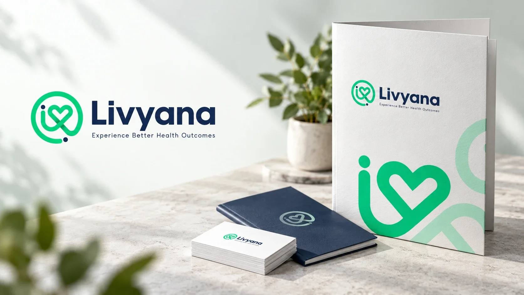
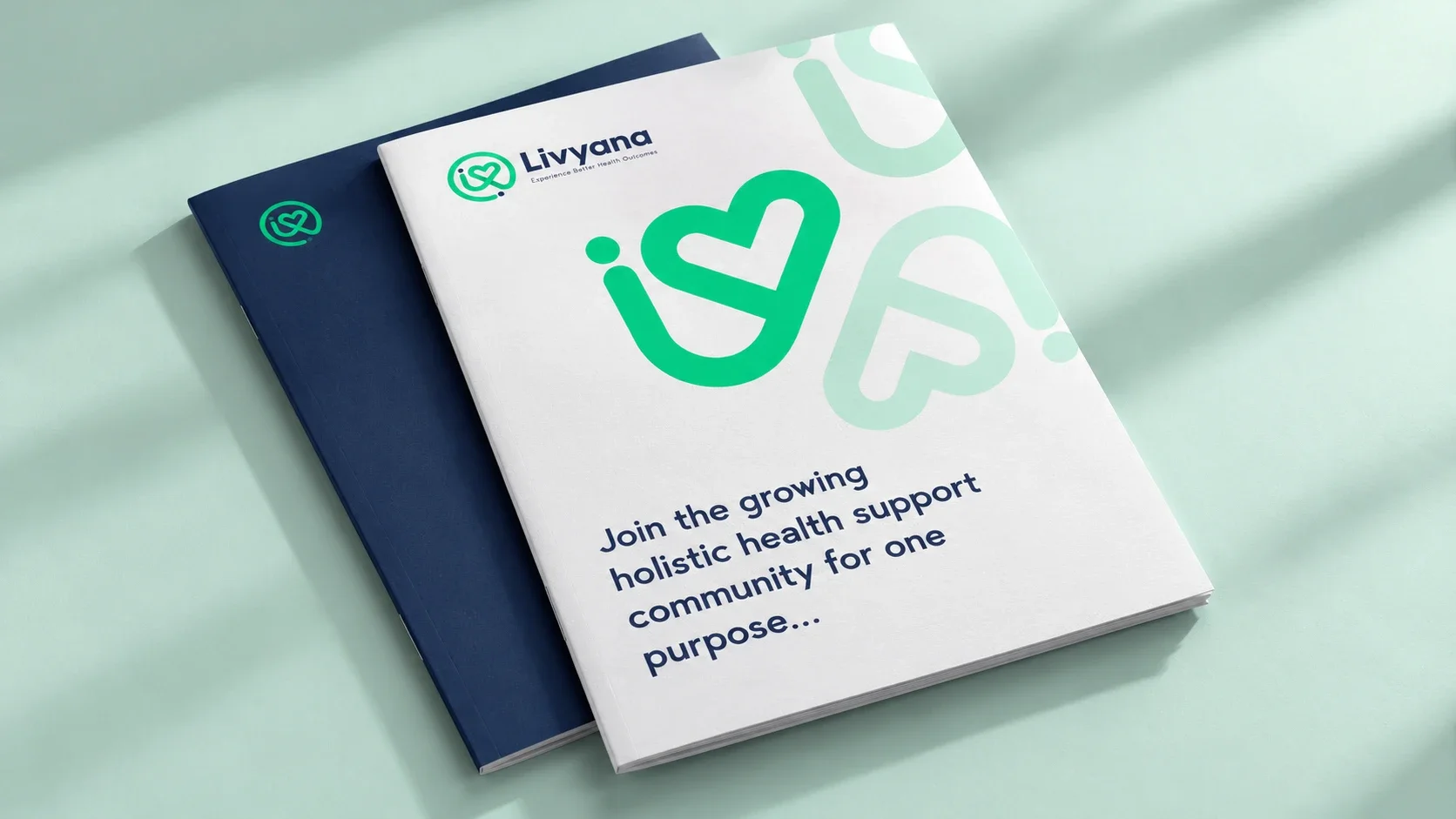
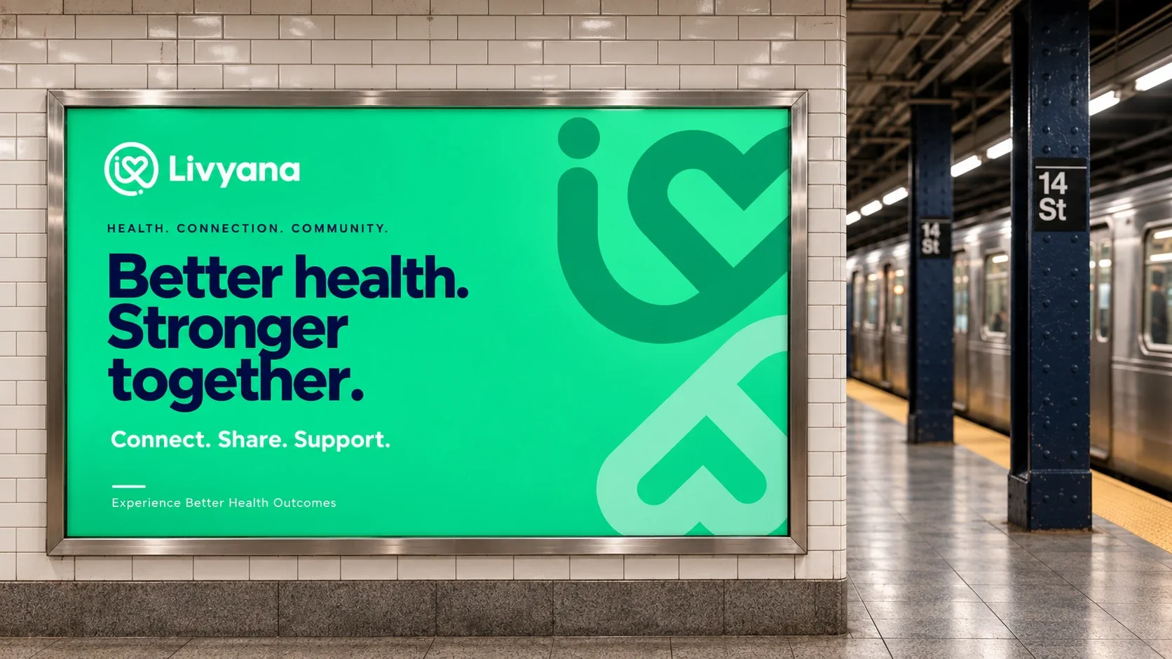
A warm identity for a health community. A brand identity connecting ideas of care, people and community in one continuous mark.
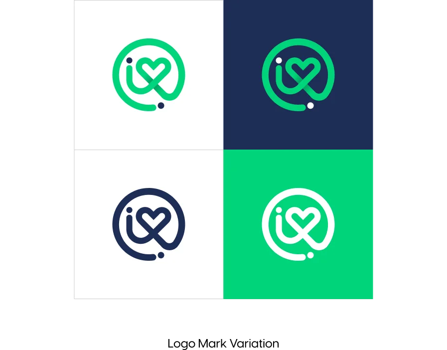
L, Y, a heart, community and peopleMark
Livyana green and navy2 primaries
Want to discuss a similar project?
Discuss your community brandFive ideas in one mark.
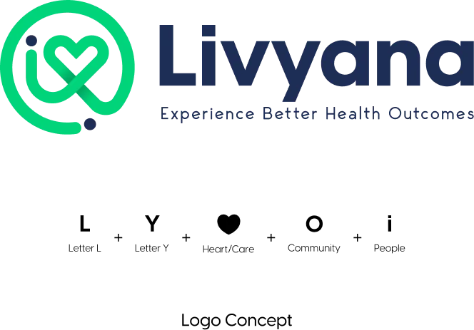
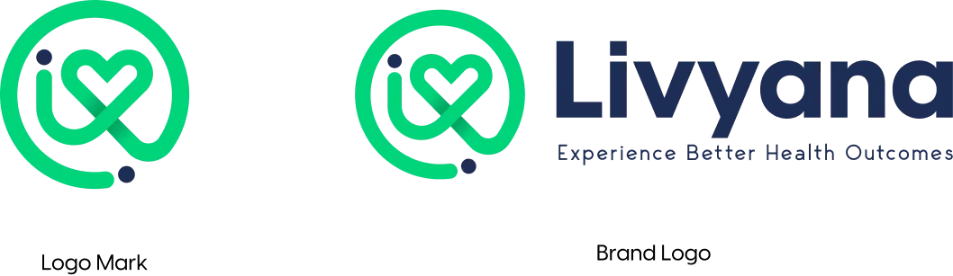
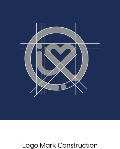
The mark combines the letter L, the letter Y, a heart for care, a circle for community and the dot of an i for people, drawn as one continuous line.
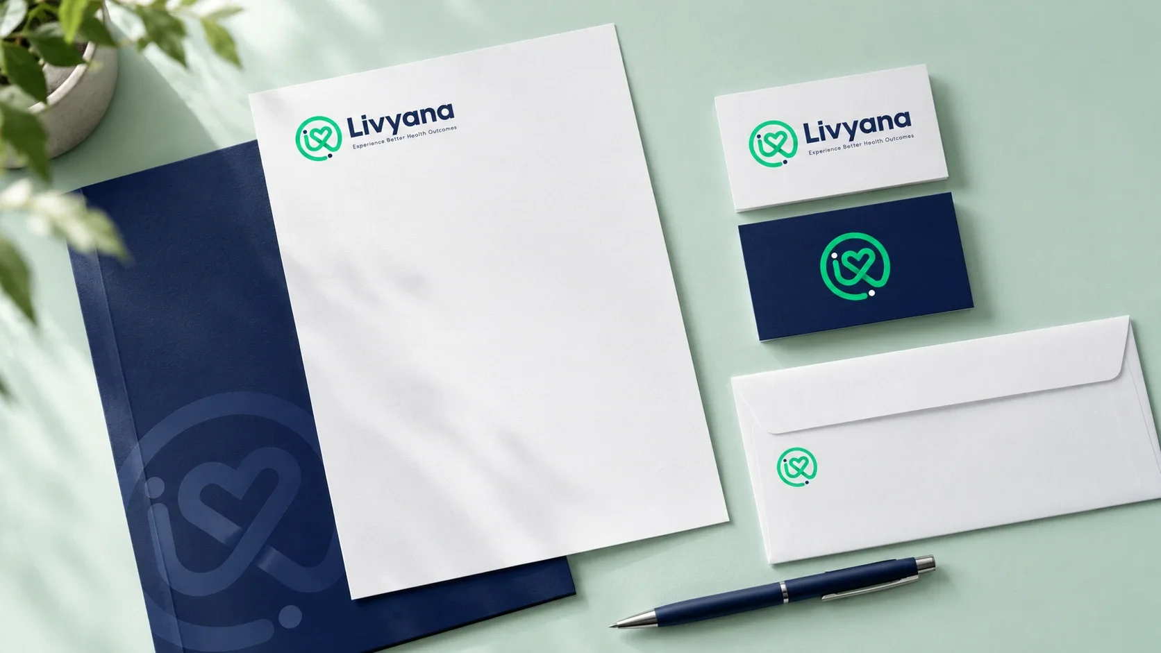
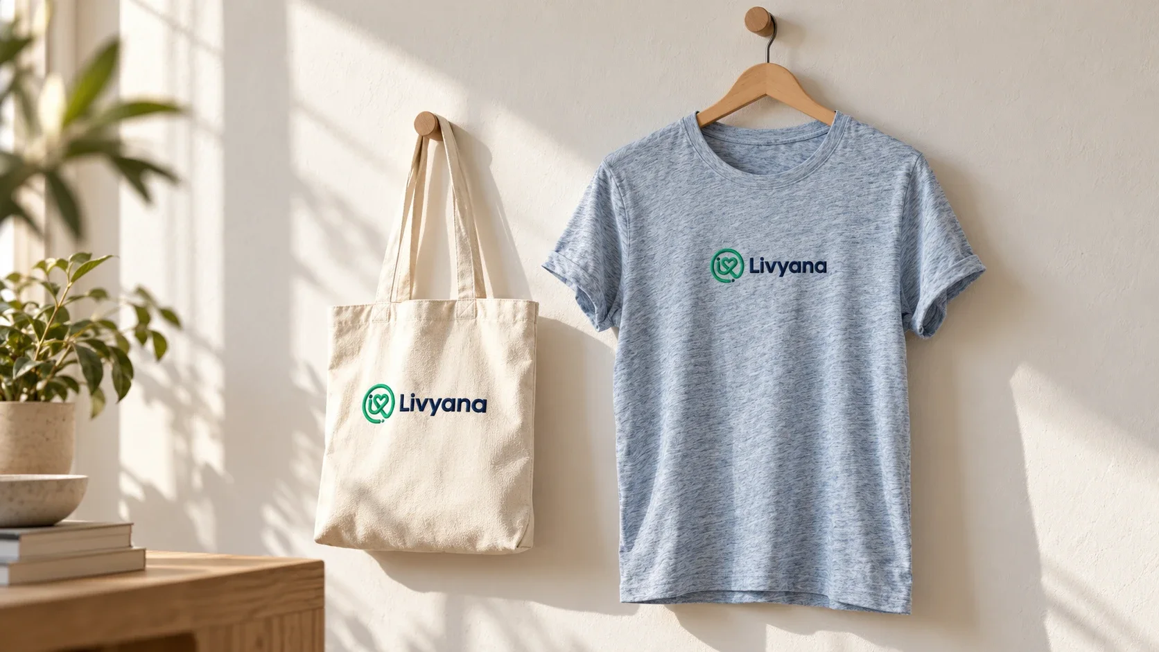
It sits beside a rounded, friendly wordmark and the line Experience Better Health Outcomes.
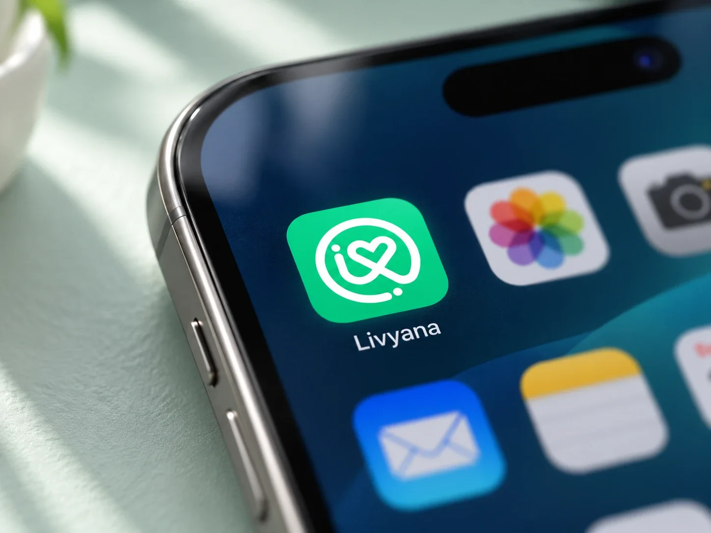
The mark, on every phone.
On the app icon the mark turns white on Livyana green, so it stays clear and recognisable at the smallest size.
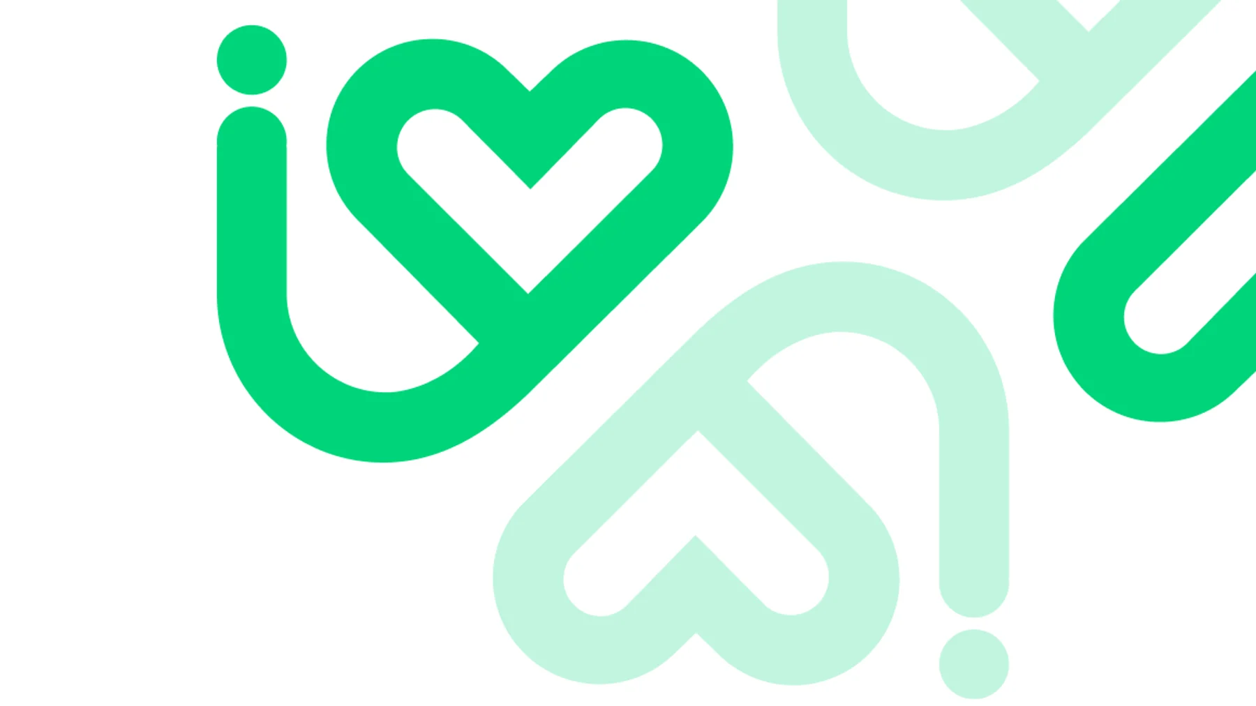
Livyana green and navy.
- Livyana GreenHEX #00CF73CMYK 69, 0, 74, 0RGB 0, 213, 122
- NavyHEX #19294BCMYK 98, 87, 38, 32RGB 30, 46, 86
- Deep TealHEX #00474DSecondary
- MistHEX #D3DCF2Secondary
Bold and rounded.
- BoldVisby CF
Headlines and the wordmark: geometric, confident and warm.
- RegularGeorge Rounded
Body text and the tagline, soft and easy to read.
Have a project in mind?
Tell us what you're working on. We'll suggest a clear first step, with no obligation.
Discuss a project