Brand identity for a premium real estate developer
Kenarc
About the project
A quieter, more assured identity for Kenarc, a Mumbai-centric developer of premium residential and commercial spaces.
Want to discuss your project with our team?
Book a callLuxury, thoughtfully designed.
Kenarc plans, builds and delivers premium homes and workspaces in Mumbai, with in-house technical, legal and infrastructure expertise. What sets it apart is discipline: control over every stage of development.
The brand had to say that calmly. Premium real estate doesn't need exaggeration or urgency, so the identity speaks with confidence, clarity and restraint, under one brand line: Luxury, Thoughtfully Designed.
Confident, never arrogant.
We defined how Kenarc sounds before how it looks: confident, thoughtful, clear, approachable and precise. Never loud, gimmicky, overly sales-focused or casual.
Its purpose: to create spaces that offer confidence, clarity and long-term value, by doing things the right way, every time.
Built from modular architectural blocks.
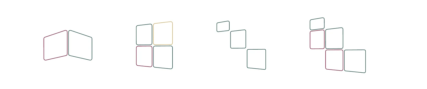
The logo is assembled from blocks, like a building: precision and structure, disciplined growth, and many capabilities unified under one vision.
It comes as a primary logo, a stacked logo, a logomark and a brand seal carrying the brand line.
 LogomarkFor icons and small spaces
 Stacked logoFor tighter, taller layouts
 Brand sealCarries the brand line
Burgundy, teal and heritage gold.
- Kenarc BurgundyHEX #741C35CMYK C0 M76 Y54 K55Pantone 7421 C
- Kenarc Deep TealHEX #234A47CMYK C53 M0 Y4 K71Pantone 5467 C
- Heritage GoldHEX #CBAE67CMYK C0 M14 Y49 K20Pantone 4515 C
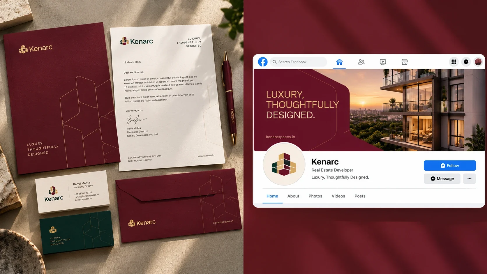
One logo, three colours, every surface.
The primary logo leads, with a stacked version for tighter spaces and a logomark for icons. Each works in full colour on light grounds and in a single colour on the brand palette.
 Primary logoFull colour on cream
 Primary logoGold on Burgundy
- Primary logoGold on Deep Teal
 Primary logoBurgundy on Heritage Gold
 Primary logoDeep Teal on white
 LogomarkGold on Burgundy
- Stacked logoFull colour on cream
- LogomarkFull colour on white
 Stacked logoGold on Deep Teal
One typeface, chosen for its architecture.
- Primary typefaceStage Grotesk
Chosen for its clarity, modernity and architectural balance, it carries the whole brand from headlines to letters.
- Light to Extra BoldTen styles
Light, Regular, Medium, Bold and Extra Bold, each with an italic, cover everything from hoardings to fine print.
Structural, not decorative.
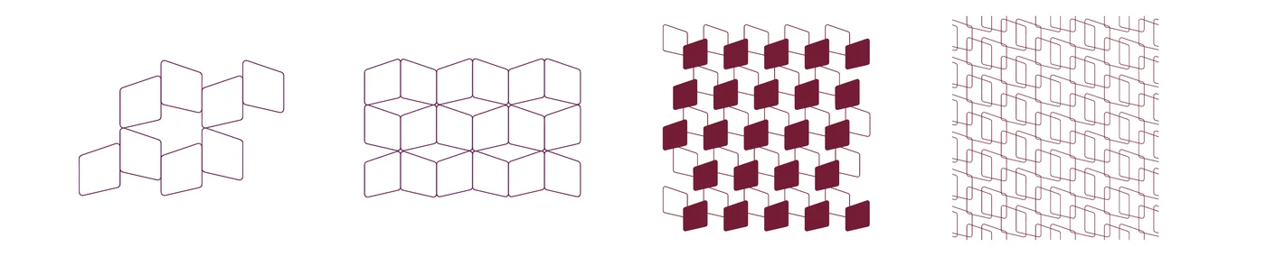
Single blocks from the logo become the graphic language: rotated, overlapped, framed and scaled in proportion.
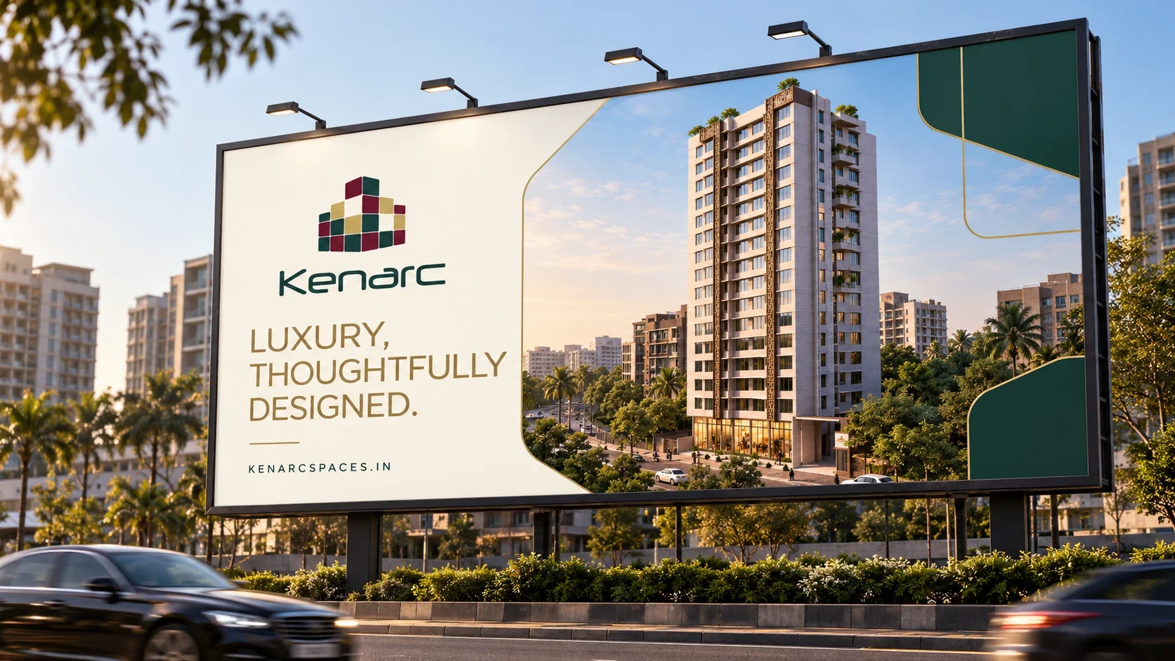
Patterns are built from one element family at a time, for brochures, hoardings, presentations and digital platforms.
Calm on every feed.
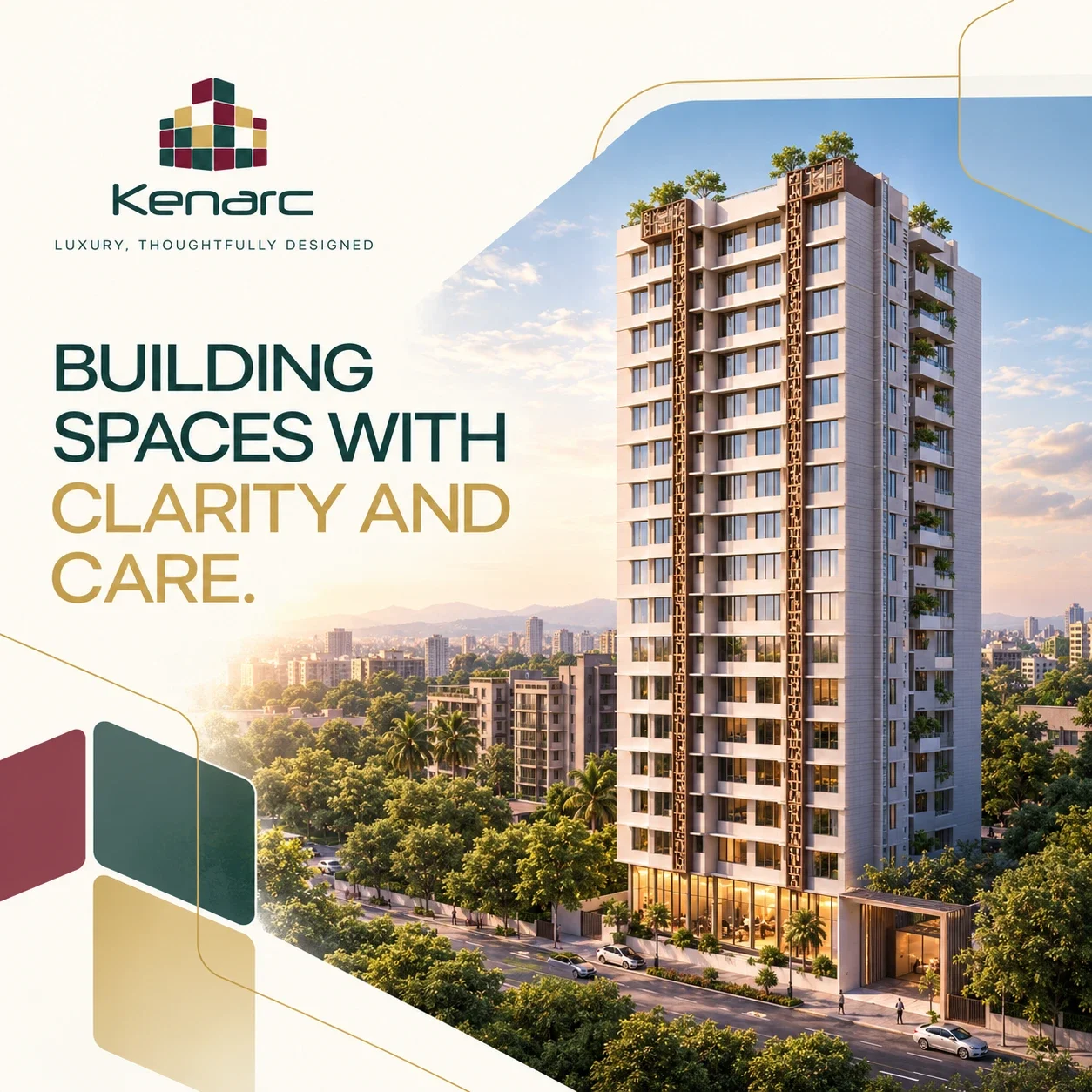
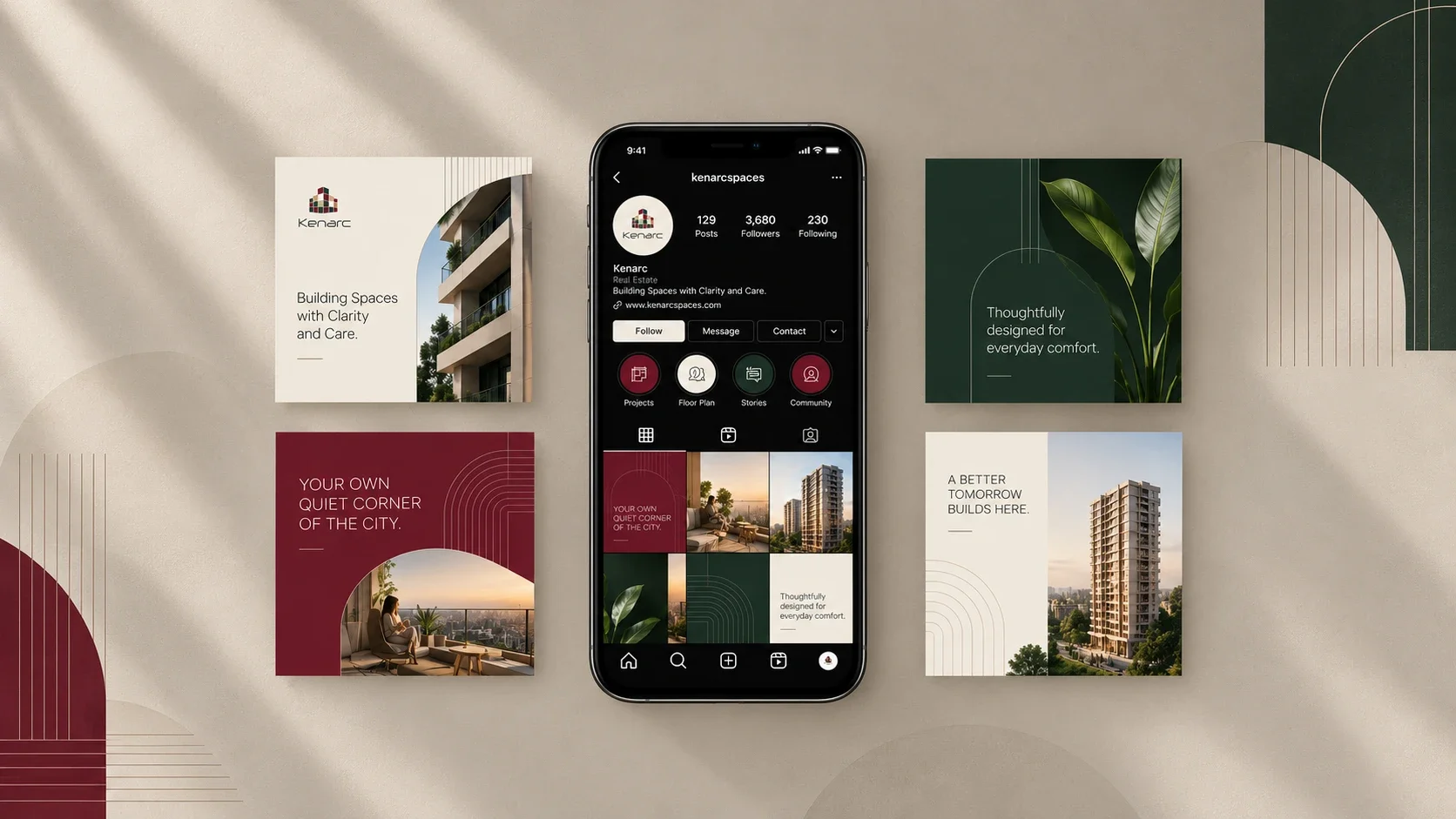
Posts for Kenarc and its Premia residences carry the same restraint as the brand: a single line, real spaces, and the burgundy, teal and gold palette.
A 38-page brand book.
Voice and tone, purpose and mission, logo rules and clear space, a full colour system with tints and opacities, typography, photography, the graphic language and the brand in use, so every team applies Kenarc the same way.
Have a project in mind?
Tell us what you're working on. In a free 30-minute call we'll suggest a clear first step, with no obligation.
Start a project